Monday, April 12, 2010
Teri Seidman, The Living Room, Urban Family Lifestyle
Pure beauty times two:
A sumptuous living space by Teri Seidman,
and the gorgeous photograph of it taken by Dustin Peck
Sarah Catherine Murphy, Living Room, Young Professional Lifestyle
Behind every successful room lies an inspiration - an idea that was discovered and the layers peeled away to uncover details and create emotion. In designing my living room space, my challenge was behind what emotion I wanted my viewers to take home with them. I wanted my space to be more than just beautiful pieces of furniture and a cohesive composition. I wanted it to have depth - depth which hid beneath the surface, only to be uncovered and the pieces connected to tell an unexpected story.
Being a Charlotte native, I realized that the inspiration behind my room was quite simple. Charlotte’s steady growth continues to rise as young professionals from across the region embrace this city, allured by majestic tree-lined streets, innovative communities, and the kinetic energy of uptown. Under the surface Charlotte brims with a history rich in tradition and American rebellion, a spirit which perhaps inspires it’s new inhabitants from centuries past. This wave of newcomers are, in essence, becoming the face of the new Charlotte.
The modern living room not only creates an indescribable level of comfort in which the new resident calls home, but also tells a story ... a story that provides a backdrop and allows a young professional to shed light on Charlotte’s mystery by telling its history and reclaiming Charlotte’s identity.
Soaked in the warmth from its jewel tones, bronzes, and warm chocolates, the room’s palette pays heritage to the gold that was first discovered in Charlotte’s soil before gold was ever discovered in California. New York based artist, Paul Hunter, makes a statement with his vibrant gold, white gold, bronze, copper and oxidized metal canvas pieces through Shain Gallery.
Vintage and vintage-inspired seating are upholstered in rich textures signifying George Washington’s initial visit to this great city, claiming Charlotte’s soil was like no other - it was one of its own personality. A detailed custom sofa crafted by Design Services of Charlotte is upholstered in a Pollack wool with contrasting back cushions in a soft herringbone linen by Donghia. Vintage chairs by Kroehler, one of Charlotte’s leading furniture manufacturers of the past, are covered in a soft tweed accented with Bergamo’s graphic Zig Zag print. City Supply Co. provided the vintage inspired occassional chairs, in a milky Perennials cotton velvet, adding durability to the already unique chairs. The layers of textures add depth to each piece and serve as a background for the Osborne and Little metallic pillows through Jennifer Fadel at Bella Studios, adding an edgy, yet sophisticated style to the room.
The corner of Trade and Tryon Street once served as the central trading post for the Native Americans of this area. Designer’s Window carefully applied a vibrant feather trim to a neutral window treatment while the print in the plush Stark area rug carries the subtle Native American details throughout the space.
“During the American Revolutionary War, British commander General Cornwallis occupied the city but was driven out afterwards by hostile residents, prompting him to write that Charlotte was "a hornet’s nest of rebellion," leading to another city nickname: The Hornet's Nest”. The bronze and gold nest-shaped chandelier illuminates the room and compliments the texture of the entertainment unit as a unique reference to the form of a hornet’s nest.
Becoming one with the personality of its canvas, this living room allows history to meet style while evoking a feeling of warmth to create a modern-vintage “home.”
Sarah C. Murphy
sarah catherine
STUDIO OF DESIGN
style defined
704.488.4713
sarah.catherine@me.com
Friday, April 9, 2010
Pam Jones, Powder Room, Empty Nest Lifestyle
* photo by dustin peck at dustinpeckphotography.com *
Spring has not only sprung in Charlotte the last couple of weeks, but also at the Metropolitan, the location of the 2010 Symphony Guild Designer House Tour.
Just a few short weeks ago there was a cold chill in the air, and the landscape was barren. But gradually the chill began to lift, and with that the creative spirit at the Met began to emerge.
Don’t you just love this time of year? When everything is just on the cusp of new life? One of the many good things about spring is that without it, and without the absence imposed by fall and winter, we might fail to appreciate the beauty around us. So much of the wonder of spring is found in the return of what was absent.
The condos at the Met began as blank canvases, complete with concrete floors, bare walls, and basic lighting. And although the spaces were beautiful in their sparse form, something wonderful began to happen. Just as the beautiful trees and flowers began to bloom outdoors, colorful paint went up on the walls, sparkling lights were installed, and flowing drapery began to transform the enormous windows, and therefore the interiors of the condos.
Just as new splashes of colors were introduced to the earth’s canvas, spring was also emerging inside the Met.
Spring is my favorite time of the year, and I see spring as the gift of a new beginning, and new inspiration for life. Just as the barren trees and drab landscape have given way to vibrant color and lovely flowers, the interiors at the Met have been dressed in some of Charlotte’s finest art displays, and by talented local designers. Every day there are new and exciting discoveries happening at the Met, and they all represent new life, both indoors and out.
Fulfill your spring inspirations, and celebrate with us by attending the Symphony Guild Designer House beginning April 17, 2010.
Friday, March 26, 2010
Brushstrokes Design Studio and Pam Jones, the Powder Room of the Empty Nest Lifestyle
Watch Robin and Lana apply a stencil and handpainted pattern to the powder room walls, and hear about all their other creative projects!
Labels:
charlotte culture,
designer house,
faux finishes
Tuesday, March 16, 2010
Monika Nessbach, Designer of the Master Bedroom, Young Professional Lifestyle
DREAM BIG! And I mean real big…like 76” x 20” big! In keeping with the design concept of rejuvenation and inspiration, we wanted to incorporate the word “dream” into the master bedroom. Not only does it inspire, but it also most accurately designates the room’s primary function. We believe the word itself creates an impact and rightfully deserves to be painted in red, evoking passion and intensity while simultaneously harmonizing with the crisp white walls and offsetting the energetic lime green feature wall. The most remarkable feature of the “dream” stencil is its vertical placement, which was the product of a mix-up over coffee one morning.
Thanks to the Symphony Guild of Charlotte and thanks to the MET Terraces for letting us DREAM BIG! We cannot wait for the big grand opening.
Thursday, March 11, 2010
Sarah Rees Hamilton, Designer of the Master Bath, Young Professional Lifestyle
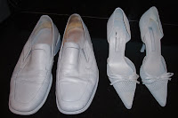
What's up with these shoes? They look like ghost shoes, right? They are actually a work in progress with over 40 other pairs of shoes that will soon be bright shades of red and green. A few more coats of paint and voila! They will be adorning the shelves in the His and Hers closets of the master suite of unit 210 in this year's Designer House. I'm excited about their integration into the design - They will be bringing pop and flare to our closets while explifying the functionality of the custom cabinetry in the space. Stay tuned, we'll be providing pictures of the finished product in our next entry.
Monika Nessbach of designbar LLC and I are thrilled to be included in 2010's Designer House! Our Master bedroom/bath concept represents an oasis of urban contemporary luxe chic paired with timeless modernism. The space is intended to soothe, re-energize and inspire. A perfect retreat for the young professional. We can't wait for you to see it!
Monday, March 8, 2010
Anita Holland, Designer of the Kitchen, Young Professional Lifestyle
Distinctive Design Features with Contemporary Elements
We are delighted to be a part of the Symphony Guild Designer House at The Met. We are designing the kitchen in the Young Professional's unit and it has been a very inspiring space to work with. We could not have pulled this off without our vendors and the team from the Symphony Guild Designer House and are privileged to be part of this year’s event.
The design elements in the kitchen are a combination of Carrara marble, lacquered cabinets, abundant natural light, and a view of the skyline. An oversized painting entitled Columbus Avenue, by Geoffrey Johnson, is the primary focal point and sets the tone of the room. Additional art by Terry DeLapp and Nicora Gange transforms the space into a beautiful and sophisticated room for early morning coffee and entertaining friends.
Subscribe to:
Posts (Atom)